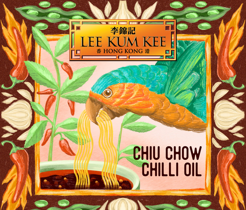
Micky's comment: The parrot at first comes across as a somewhat illogical choice to be the focus, yet it is because of that it gives you a very spontaneous, playful feeling. What is the parrot doing? Why is he chewing on some chilli noodles? At the same time there is a lot of visual repetition incorporated in the design which harnesses this spontaneity with a bit of order – key example being the curvy pointy shape of the chillies, the curvy pointy shape of the beans and garlic, and then finally the curvy pointy shape of the parrot’s own beak. The colours are also very considered with the bursts of orange on the parrot linking up with the flames around the chillies, contrasted against the fresh greens and turquoises. The only point of improvement would be to resolve the visual language of the design against the company logo – for example just by replicating the stark drop shadow of the logo into the golden frame of the design – just to bring things together a bit more.